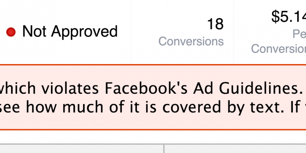
Have you ever created a great looking image for your Facebook ad only to have it disapproved because it had more than 20% text? What’s worse is that I see ads all the time on Facebook that are clearly in violation of this rule. In this quick video I’ll show you how to make sure your images stay within the 20% text rule BEFORE you upload them to Facebook.
Click Here To Try The 20% Text Grid Tool


5 Comments
Eric Thibodeau
October 6, 2014Thanks for the video !
James Grandstaff
October 6, 2014You got it Eric! Glad you liked it. 🙂
Eric Bobrow
October 6, 2014Often it’s possible to do more subtle changes to the ad to make it fit the guidelines.
Text that overlaps two grid boxes or rows can sometimes be moved a small amount (in Photoshop or your favorite artwork editing program) to fit entirely within one box or row, reducing the number of grid boxes checked. We’ve also reduced the size of some text (such as our call to action “DOWNLOAD NOW”) and/or wrapped text to two lines so that it fits within two grid squares rather than overlapping 3 or 4.
We’ve also had success with a 3D e-cover showing text on the booklet image. This seems to be accepted as a non-text graphic, yet allows us to have more text-style messaging in the photo.
James Grandstaff
October 6, 2014Thanks for the tips Eric! Good stuff.
Eric Bobrow
October 6, 2014Here’s a post that suggests that Facebook is very inconsistent in enforcing the 20% text rule, and in fact may deliberately ignore it:
https://econsultancy.com/blog/65218-has-facebook-quietly-dropped-the-20-text-limit-for-promoted-post-photos#i.auzj7m1bltf3rw
Leave A Response